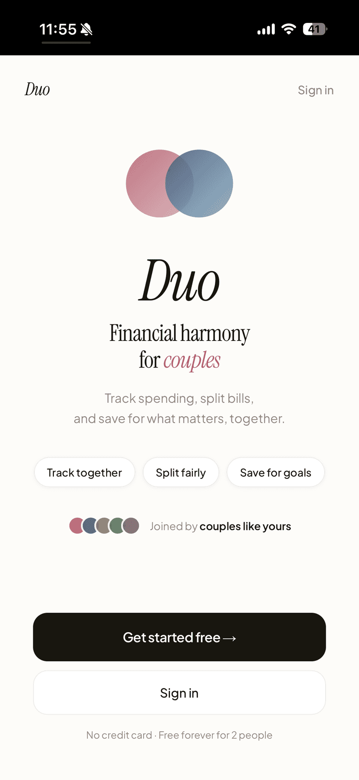
Duo: Couple's Financial Harmony
An AI-powered finance app for couples who share expenses but keep separate accounts.
Project Background
When my wife and I got married, we ran into a problem neither of us expected: managing money as a couple. We had separate bank accounts, shared expenses, and no good way to answer simple questions like "How much did we spend on groceries this month?" or "Are we on track for our savings goal?"
My wife and I tried every app out there. They all failed us in different ways, so I decided to build the solution myself.
Goal
To create a financial tracking app that helps couples manage "yours, mine, and ours" finances without the friction of spreadsheets or the awkwardness of "you owe me $5" transactions.
My Roles & Responsibilities
As the Founder & Product Manager, I was in charge of:
- Conducting competitive analysis and identifying market opportunity after Mint's shutdown
- Writing comprehensive PRD with user stories, MoSCoW prioritization, and phased roadmap
- Designing and building the MVP (Next.js, Supabase, Tailwind v4 + Shadcn UI, Google Gemini API)
- Creating the "Rose & Sand" design system with comprehensive design tokens
- Running user testing sessions and iterating based on feedback
- Defining success metrics and measuring product-market fit
The Key Problem
How might we help couples track shared finances without forcing them to merge accounts or manually split every transaction?
Existing solutions fall into two broken categories:
| App Type | Problem |
|---|---|
| Traditional budgeting apps (Mint, YNAB) | Require manual categorization of every transaction and don't distinguish between personal vs. shared expenses |
| Expense splitting apps (Splitwise, Venmo) | Create a transactional "IOU" dynamic that feels awkward in intimate relationships |
| Joint account solutions (Zeta) | Requires opening new accounts. Most couples want to keep some financial independence |
The gap: No app handled the nuance of "yours, mine, and ours," where couples share some expenses but maintain individual spending too.
The Solution
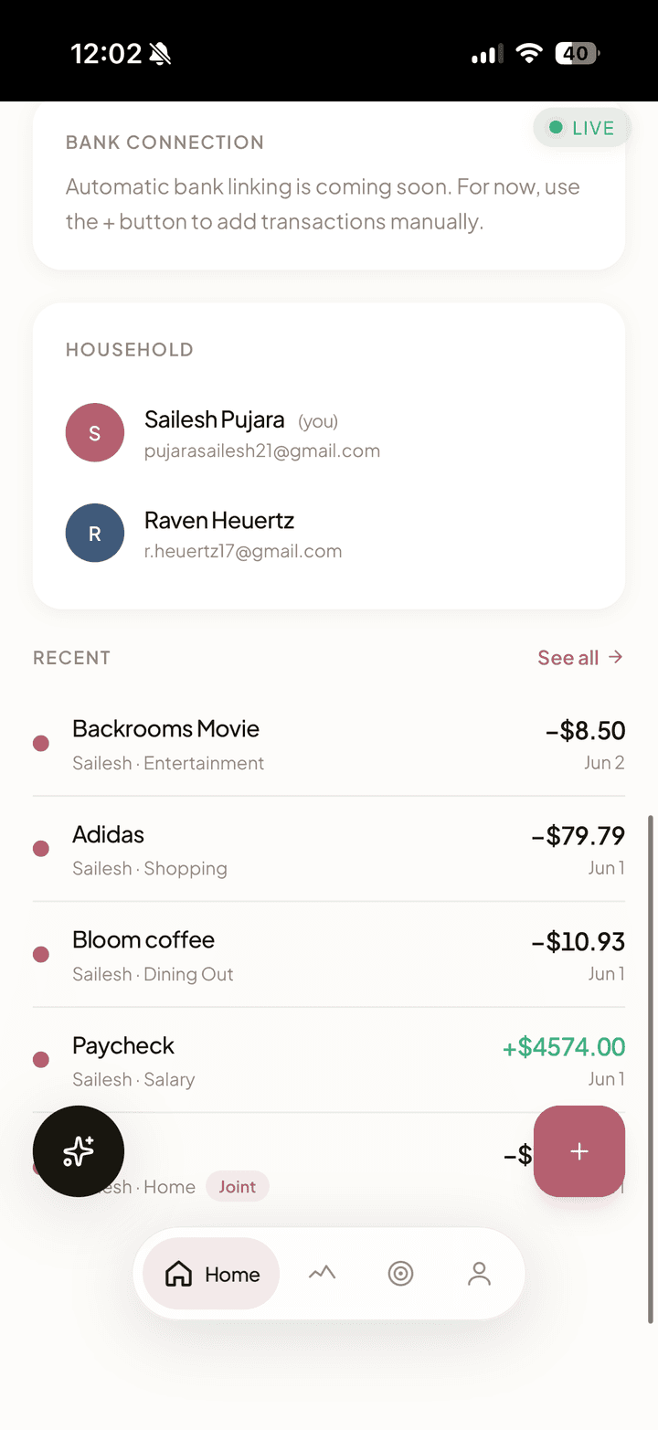
Duo is a Progressive Web App built around a "yours, mine, and ours" philosophy. Each partner logs spending and income, then toggles any expense between "Personal" and "Joint" with one tap. AI cleans up and categorizes transactions, a shared dashboard shows the breakdown, and changes sync to your partner's view in real-time via Supabase Realtime. No refresh needed.
Try the live app | View Full PRD on Google Docs
Key User Flows
-
Onboarding Flow: Sign up with email, create household OR join via partner's invite code, connect bank account via Plaid
-
Daily Usage Flow: Open app, see unified transaction feed, toggle any transaction between Personal and Joint. Partner sees change in real-time via Supabase Realtime.
-
Goal Tracking Flow: Set shared or personal savings goals, track progress with visual bars and "$X to go" messaging, celebrate when goals are reached.
Competitive Analysis
I analyzed 5 direct and indirect competitors:
| App | Positioning | Gap |
|---|---|---|
| Mint (Intuit) | Comprehensive personal finance tracker with budgeting, bill tracking, and credit score monitoring | Requires manual categorization; no distinction between personal vs. shared expenses; shut down in 2024 |
| Splitwise | Expense splitting app for roommates, friends, and couples to track who owes whom | Creates transactional "IOU" dynamic that feels awkward in relationships; focuses on debt settlement |
| YNAB | Zero-based budgeting app with strong educational component and manual envelope system | Steep learning curve; requires significant manual input; doesn't handle "yours, mine, ours" nuance; expensive ($99/year) |
| Zeta | Joint banking and budgeting app specifically for couples, with shared accounts and cards | Requires opening new bank accounts and switching primary banking; forces full financial merging |
| Honeydue | Couples finance app with transaction feed, bill reminders, and chat functionality | No AI categorization; clunky UX; limited real-time sync; doesn't clearly separate personal vs. joint spending |
Duo's differentiation: The "Joint Toggle," one tap to classify any transaction as shared, with real-time sync to your partner. No new bank accounts required. AI handles the tedious categorization work.
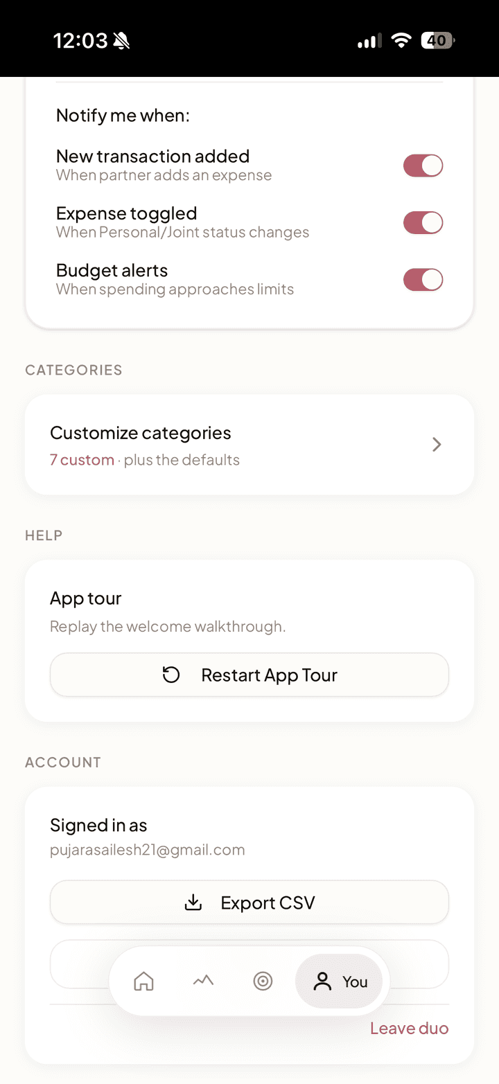
Key Features
The Joint Toggle
One-tap toggle to classify any transaction as "Personal" or "Joint." Changes sync instantly to partner's view via real-time database subscriptions.
Manual-First, Plaid-Ready
Users can manually add transactions and income immediately, no bank credentials required on day one. Plaid integration is built and ready for when users are comfortable connecting accounts. This was a deliberate product decision: manual entry reduces onboarding friction and removes the trust barrier of handing bank credentials to a new app.
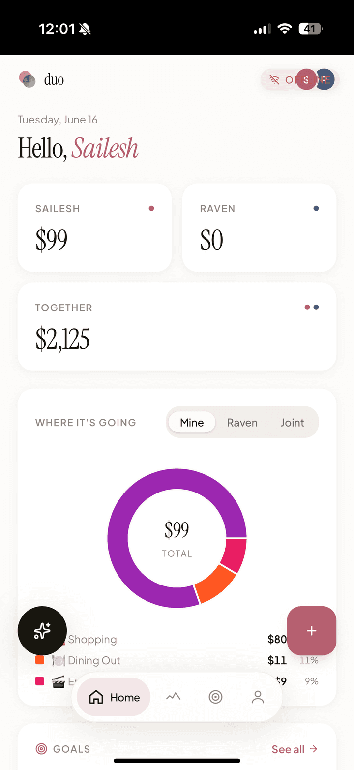
Unified Dashboard
Four components give couples a complete financial picture at a glance:
- Spending Summary Cards: My Spending, Partner's Spending, and Together totals with budget progress bar
- Spending by Category Chart: Donut chart showing top 5 expense categories with remaining grouped as "Other"
- Goals Preview: Compact view of top savings goals with progress bars
- Budget Progress Bars: Category-specific budgets with color-coded warnings (green → amber at 80% → red at 100%)
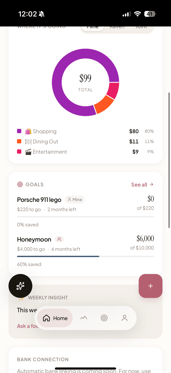
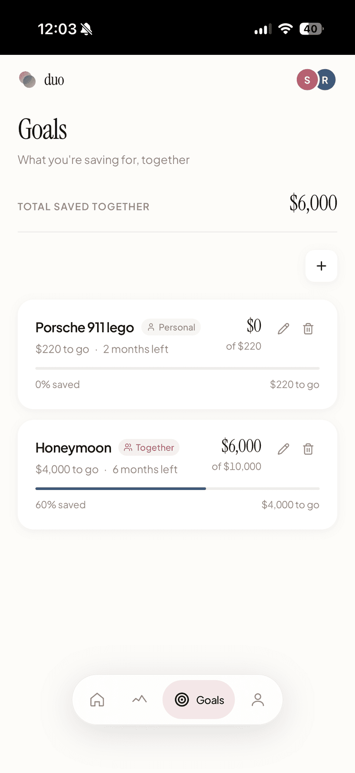
Shared Savings Goals
Couples can create savings goals with target amounts, track progress, and set optional deadlines. The feature lives both as a dashboard preview and a dedicated goals page.
The hardest product question was ownership: who can edit a shared goal? I built a joint vs. personal ownership model where joint goals can be edited by either partner, while personal goals can only be modified by the creator. Both partners can see all goals for transparency, but edit/delete permissions respect ownership. The UI communicates this clearly with "Together" and "Personal" badges.
Each goal shows a progress bar, percentage, "$X to go" messaging, and deadline countdowns ("142 days left" or "Past deadline" in red).
Spending by Category
The dashboard numbers answered "how much are we spending?" but users kept asking "on what?" I added a donut chart that breaks down spending into the top 5 categories, with everything else grouped as "Other." Each slice uses the category's custom color, with a legend showing category name, amount, and percentage.
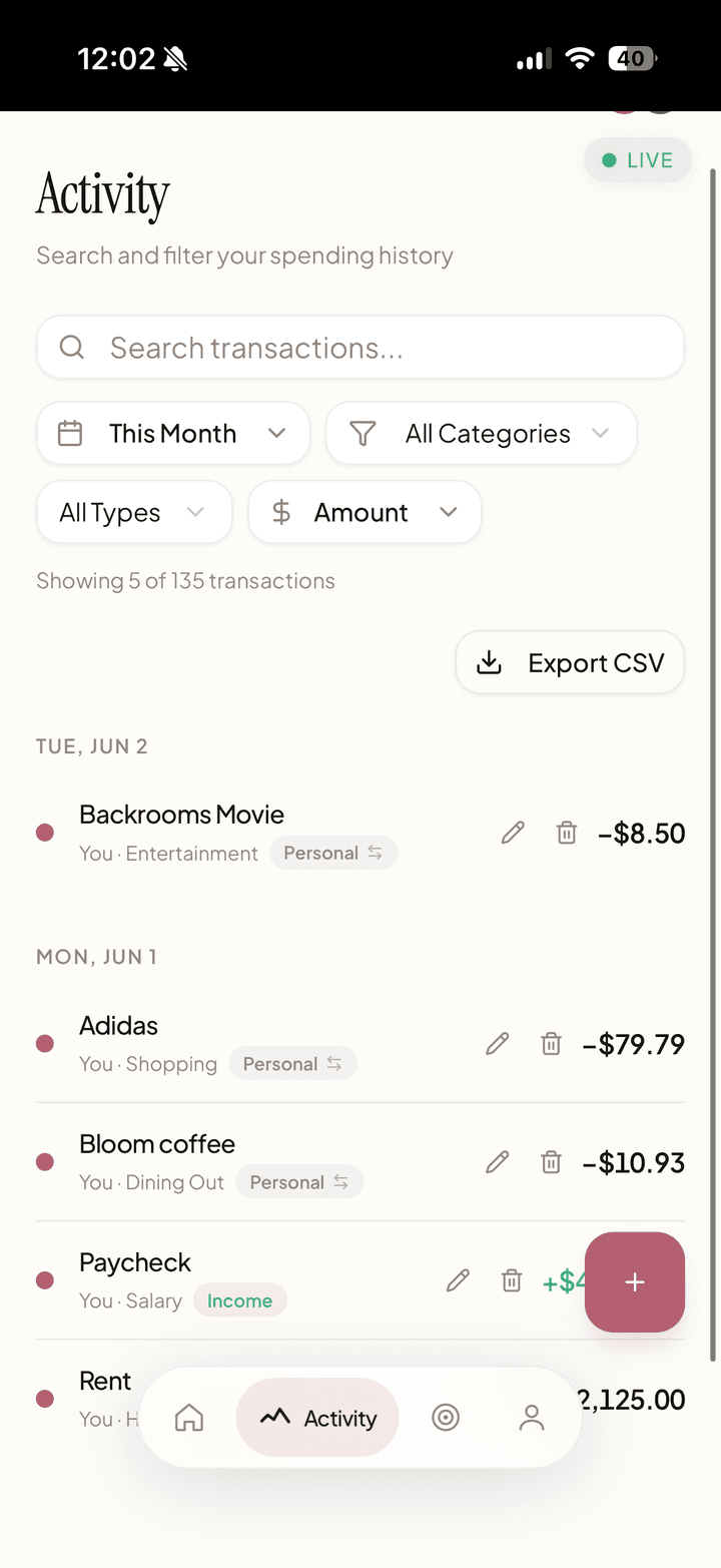
Income & Settlement Tracking
Income is always classified as personal, a deliberate product decision. Salaries are sensitive even in shared finances, and auto-including both incomes in household totals would create confusion. Users can still track income for personal budgeting without it affecting the shared spending view.
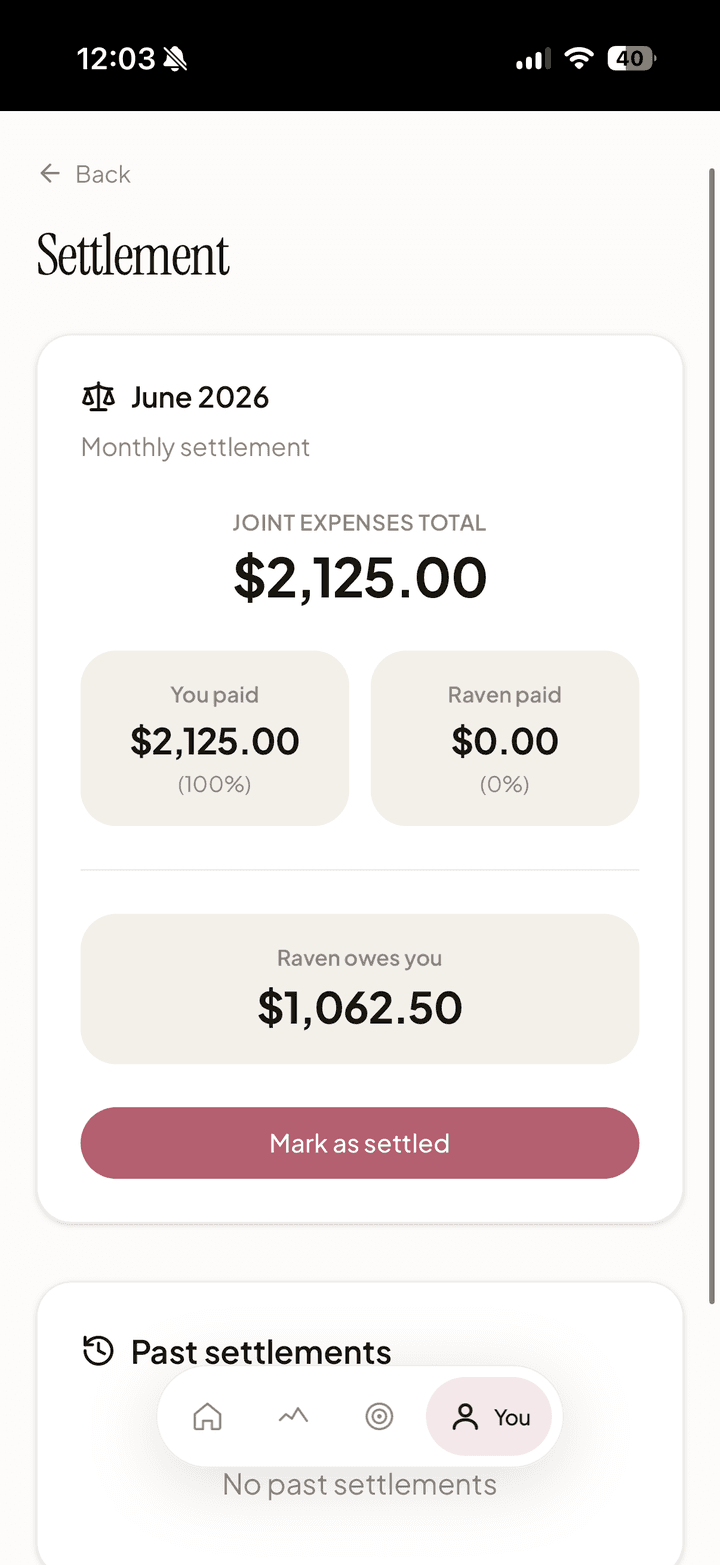
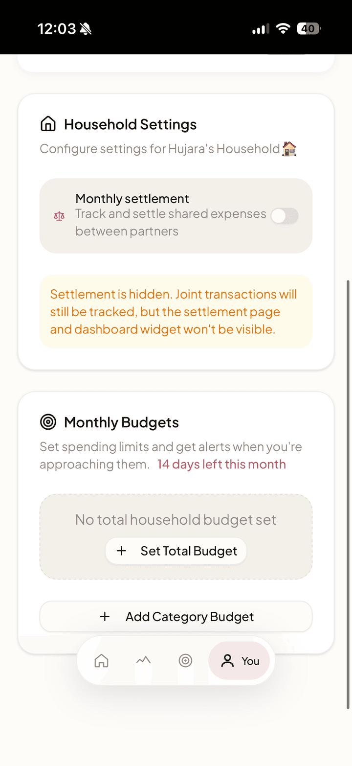
For settling up joint expenses, Duo calculates who owes whom at the end of each month. Instead of the awkward "you owe me $5" dynamic that Splitwise creates, Duo frames it as a monthly settlement: one number, one conversation, done. Partners settle up externally via Venmo or Zelle.
Custom Categories & Budgets
Users create custom spending categories with emoji icons and color pickers. Each category can have its own monthly budget with alert thresholds. The budget bars change from green to amber at 80% and red at 100%, giving couples a visual warning before they overshoot.
AI Auto-Categorization
Google Gemini API cleans messy bank descriptions ("AMZN MKTP US*2K83J") into readable names ("Amazon") and categories ("Shopping"). Users can override if AI gets it wrong.
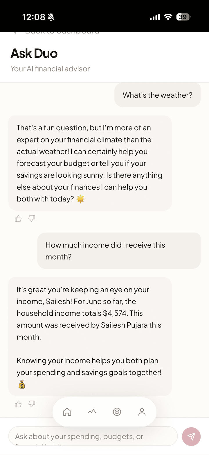
AI Financial Therapist: Deep Dive
The Insight
Couples don't fight about money, they fight about understanding money. "Why are we over budget?" turns into blame because neither partner has context. Traditional finance apps show data but don't explain it.
The Solution
A conversational AI interface where couples can ask natural language questions about their finances and receive empathetic, data-backed answers grounded in their actual spending data.
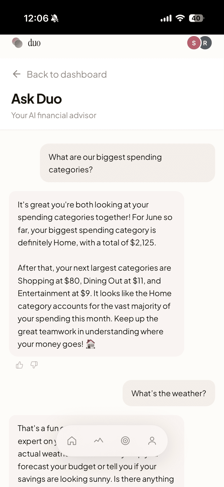
Example Interactions
- "Why are we over budget this month?" → "Your dining out spending jumped 35% compared to January, about $180 more. Most of it happened the weekend of February 15th."
- "Are we on track for our savings goal?" → "Your Robot Vacuum goal is at 62% ($310 of $500). At your current pace, you'll hit it around March 22nd."
What I Built
| Component | Description |
|---|---|
| Financial Context API | Custom endpoint that aggregates household spending data (current vs. previous period, by category, by partner, budget comparisons, anomaly detection, goal progress) into structured JSON. The AI never calculates numbers; all data is pre-computed and injected into the prompt. |
| AI Chat Backend | Gemini 2.5 Flash integration with tone-engineered system prompts. Rate-limited to 20 messages/day per household. Conversation history persisted to database. |
| Chat UI | Full chat interface with suggested questions, typing indicators, message history, and thumbs up/down feedback. Mobile-responsive. |
| Weekly Money Digest | Proactive AI-generated weekly summaries: total spending, category breakdown, goal progress, and one actionable insight. Surfaced as the "Weekly Insight" card on the home screen (automated cron planned for v1.1). |
| Security Hardening | Zod 4 input validation, in-memory rate limiting, sanitized production logging across all 6 mutation API routes. |
Key Engineering Challenges
| Challenge | How I Solved It |
|---|---|
| Hallucination Prevention | The AI never calculates numbers. All figures come from pre-computed database queries via the Financial Context API. The AI's job is to explain and contextualize, not generate data. |
| Tone Engineering | Financial conversations between couples are sensitive. Spent significant time tuning the system prompt: never blame or compare partners negatively, use "you both" and "together" language, frame high spending as observation not judgment, celebrate small wins. |
| Data Pipeline | Built a custom aggregation endpoint that computes: current vs. previous period spending, per-category breakdowns with budget limits, top merchants, spending by partner, anomaly detection (categories with >1.5x increase), and goal progress with pace estimates. |
| Production Readiness | Added error boundaries across all routes, 404 handling, realtime subscription memory leak fix, PWA meta tags for iOS install, and conditional Plaid UI based on environment. |
Skills Applied
This feature shows the difference between "AI-powered" (slapping an API call on a product) and "building AI as a product feature":
- Context injection / RAG pattern: Real financial data queried, aggregated, and injected into prompts
- Prompt engineering for domain-specific constraints: Tone sensitivity for couples, hallucination prevention
- End-to-end product thinking: Chat UI, feedback collection, proactive digests, security hardening
Product Decisions & Trade-offs
Every product is shaped by its constraints. These are the decisions I made and why:
| Decision | Why | Trade-off |
|---|---|---|
| PWA over native app | Instant access via URL, no app store gatekeeping, works on any device | Limited iOS push notifications (until recently), fewer native capabilities |
| 2-person max per household | Simplifies the permissions model and covers 95% of the use case (couples) | Excludes roommate and family budget use cases |
| No money movement | Removes regulatory burden (no money transmitter license needed) and builds trust faster | Users must settle up outside the app via Venmo or Zelle |
| AI as UX multiplier, not core feature | Auto-categorization removes friction; AI chat adds insight. But the app works fine without AI. | AI costs money per API call, requires rate limiting and cost monitoring |
| "Yours, mine, ours" data model | Respects financial independence while enabling shared visibility | Complex data model (11 tables with Row-Level Security policies) |
| Real-time sync via Supabase Realtime | When my wife toggles a transaction to Joint, I need to see it immediately, not after a refresh | Adds complexity to subscription management and cleanup |
| Income always personal | Income is sensitive even in shared finances, prevents double-counting in household budget | Can't auto-compute total household income without both partners opting in |
Design System: Rose & Sand
I created a comprehensive design system with tokens for color, typography, spacing, and animation. The palette centers on warm neutrals (stone, sand) with a soft rose as the punctuation color appearing on roughly 5% of the screen: buttons, progress bars, active states. Finance apps that lean on red and aggressive colors create anxiety. Rose & Sand is deliberately calm. The app should feel like a conversation, not a warning.
The identity reinforces the product thesis. The wordmark is a quiet lowercase "duo" next to two overlapping circles, one rose, one slate, two people whose finances overlap without fully merging. That "yours, mine, and ours" idea is in the logo before you ever open the app.
The animation system has three layers: micro-interactions (button presses, toggle slides), entrance animations (staggered card fade-ups on page load), and functional animations (progress bar fills, value counters). Every animation serves a purpose, nothing decorative.
User Testing & Iterations
| Feedback | What I Changed |
|---|---|
| Early testers found the "Joint toggle" confusing, wasn't sure if it was a button or toggle | Redesigned toggle with clearer visual states and labels showing "Personal" / "Joint" |
| Early testers couldn't find the export button | Moved export to more prominent location in navigation |
| Users wanted to see where money was going, not just totals | Built Spending by Category donut chart for the dashboard |
| Couples disagreed on who should be able to edit shared goals | Built joint vs. personal ownership model with role-based edit/delete permissions |
| Users wanted to see spending trends over time | Added to V1.1 roadmap (Spending Trends Chart) |
| Users asked about hiding surprise gift purchases from partner | Designed "Merchant Masking" feature for V1.1 (amount visible, merchant hidden) |
"Finally, an app that gets how couples actually manage money. I don't want to nickel-and-dime my husband. I just want to know if we're on budget." - Beta User
Metrics & Current Status
Primary Metric: Weekly Joint Reviews, weeks where both partners log in at least once. This measures whether the app solves the "communication problem," not just the data problem.
Current Status:
| Metric | Value |
|---|---|
| Beta users | 10 across 5 households |
| Weekly Joint Review rate | 80%+ |
| Bugs fixed within 48 hours | 6 |
| Time to MVP | 6 weeks |
My wife and I use Duo every week, and I keep iterating with our beta households toward a wider public launch.
Takeaways
What I Learned
- User testing reveals what metrics can't. I would never have found the toggle confusion or export button issue without watching real people use the app.
- "Good enough" beats "perfect." I shipped MVP in 6 weeks by ruthlessly prioritizing Must-Haves and deferring nice-to-haves to V1.1.
- Build for yourself first. The best products come from genuine pain points. My wife and I use Duo every week, and that's the ultimate dogfooding.
- AI is a UX multiplier. Auto-categorization removes the tedious data entry that kills most finance apps. Users don't have to do homework to use the app.
- Real-time is table stakes for shared apps. When my wife toggles a transaction to Joint, I need to see it immediately, not after a refresh. Supabase Realtime made this possible, and it fundamentally changed how the app feels.
What I'd Do Differently
- Start user testing earlier (even with paper prototypes)
- Set up analytics from day one to track actual usage patterns
- Build onboarding tooltips to reduce confusion on first use
What's Next
- Spending Trends: Line chart showing monthly spending over time for pattern recognition
- Merchant Masking: Hide surprise gift purchases from partner (amount visible, merchant hidden)
- Plaid Production: Move from sandbox to production bank connections
- Recurring Bill Detection: Auto-flag monthly subscriptions and recurring charges